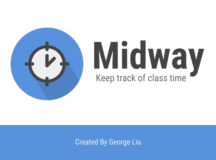
Midway changed a lot from its humble beginnings as a simple prototype to the complex extension it is now. Let’s explore how it changed. Check out the latest version of the extension on the Chrome Web Store.
A Note on Versioning
While it might seem as though I am using Semantic Versioning (or SemVer as the developer community calls it), I actually simply increase the numbers based on how significant I feel the change to be, rather than simply incrementing a major number or minor number by 1.
The Initial Prototype (v1.3.15) - February 2018
Yes, the initial prototype does not start from 0.0.0 or even 1.0.0, it starts at 1.3.15. Although it may seem unintuitive, it is actually because I’ve re-written my code several times and I didn’t feel like labeling it such a mundane 1.0.0. It’s a bit whack, but that’s ok.
But I digress.

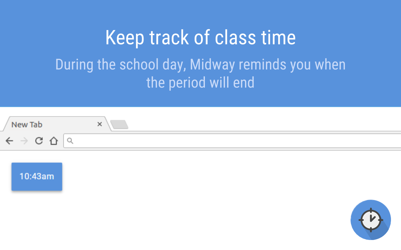
At this point, Midway was a simple extension, merely displaying the end of the period in a little box in the corner, called the timebox. Although you could move the timebox out of the way, the position did not persist across tabs. This meant that every time you refreshed the page or when you opened a new tab, Midway’s timebox was back in the top left corner. In addition, the timebox lacked a close button, which proved annoying for some users, when Midway covered an important item on the page.


No longer just a prototype (v1.4.2) - October 2018
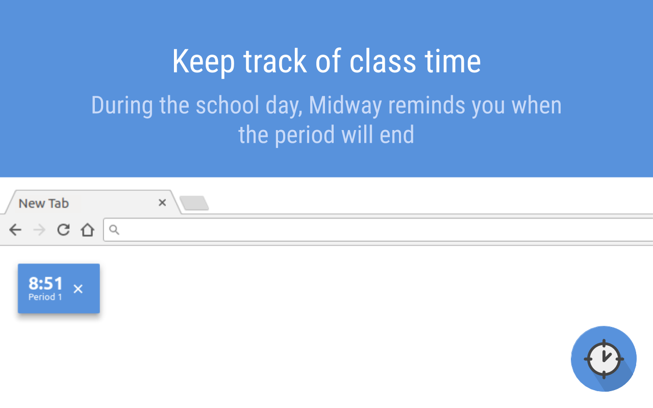
With the introduction of Midway v1.4.2, Midway has greatly increased in both capability and complexity. One of the challenges in developing Midway was the fact that, due to a Chrome browser bug, Custom Elements were NOT supported when it is registered by an extension. As a result, Midway could not be isolated from its containing page. I ended up using a workaround: injecting a script onto the page that loaded code from Github. Unfortunately, it meant that Midway no longer worked offline, but since the users were almost always online, it wasn’t much of a problem.
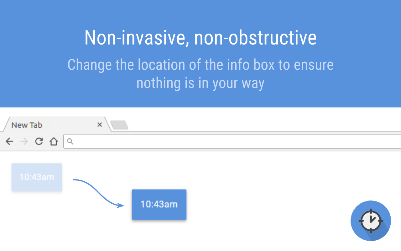
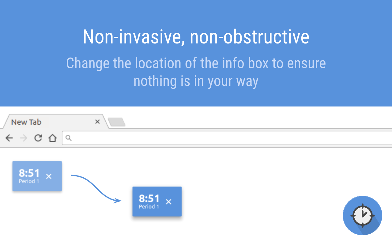
Addressing one of the primary concerns of many users, Midway now persisted the timebox on the page. What that means is if you drag the timebox to the bottom right corner, it stays there, even if you switch tabs or reload the page. However, the implementation was a bit poor since it depended on time delays. As a result, sometimes the delays didn’t fire at the correct times, resulting in glitchy timebox persistence.
In addition, Midway now had the ability to hide the timebox. Previously, the only way to get rid of it was by dragging it to the edge of the screen, a suboptimal solution for many. Now, a simple close button will get rid of it.

The Latest Evolution (v3.0.0) - Aug 2019
 At last, the versioning is brought to a number that actually makes sense; it is the third revision of Midway! I probably should have made the version number v3.1.4 because it is whack (and who doesn’t want pi?), but I thought it would be confusing. Also, the changes didn’t really warrant that sort of number.
Anyhow, Midway has improved a lot with this version. Even its clock ticked forward a bit to represent a change of such magnitude:

With this update, Midway’s timebox persistence was no longer buggy; the timebox stays right where you put it even if you reload or open another tab. In addition, glitches on sites such as the MyLearningPlan website were all fixed (due to better isolation between the extension and the website).
The Timebox
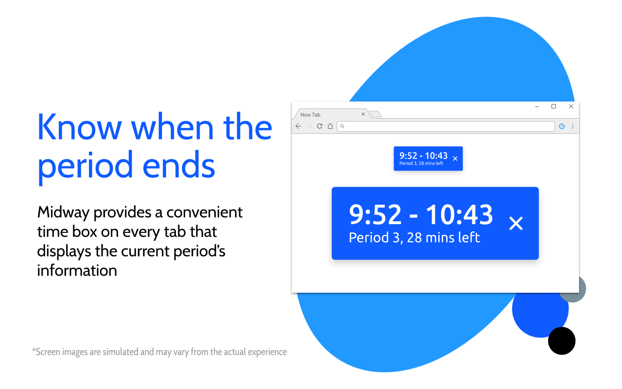
To improve User Experience (UX), Midway now includes additional contextual information to help users understand which period is currently being displayed. For instance, it now displays the current period start and end times, the current period name, and the number of minutes until the end of the period. By including them, users can understand intuitively what it means, without having to look at the support page.
Why did you choose this timebox format?
The current format of the timebox was not an arbitrary choice; rather, it was based emprically on a small focus group consisting of teachers and students.
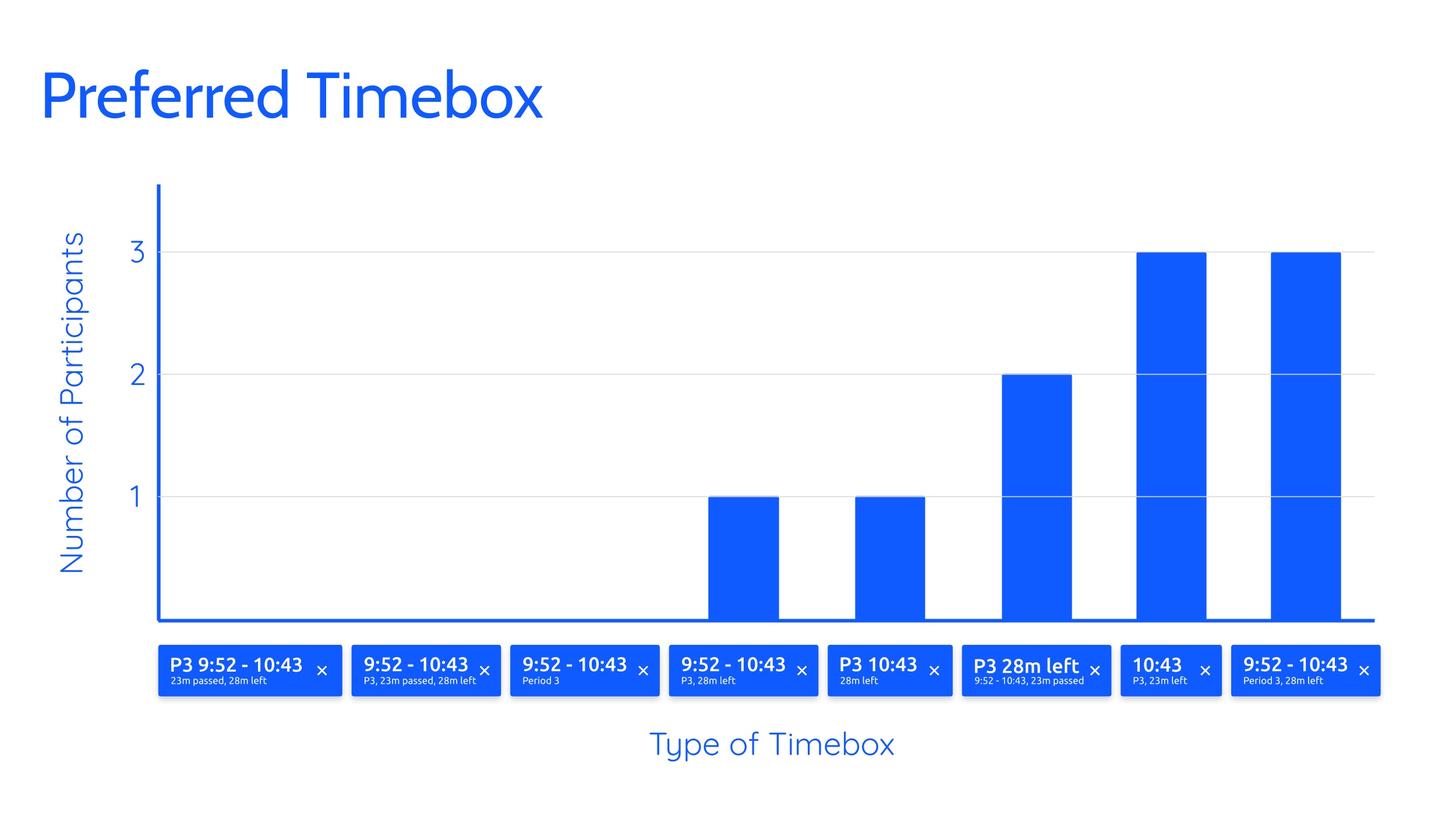
I chose the last option because of these reasons:
- It was popular (at least among the small sample)
- It included better contextual information than the next best option
- It was more explicit; it didn’t use abbreviations that may be hard for users to understand
Of course, the sample size isn’t particularly large to be entirely conclusive, but given the data I was able to collect, I believe that was the best decision.
Better controls
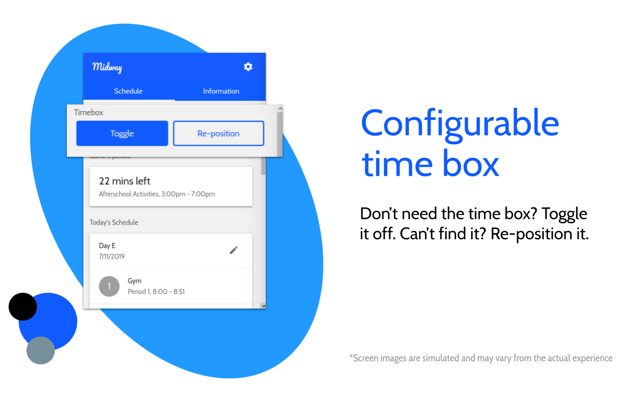
Midway now included dedicated buttons to re-position and toggle the timebox. This gave more control to users and was much more intuitive.
The Dashboard
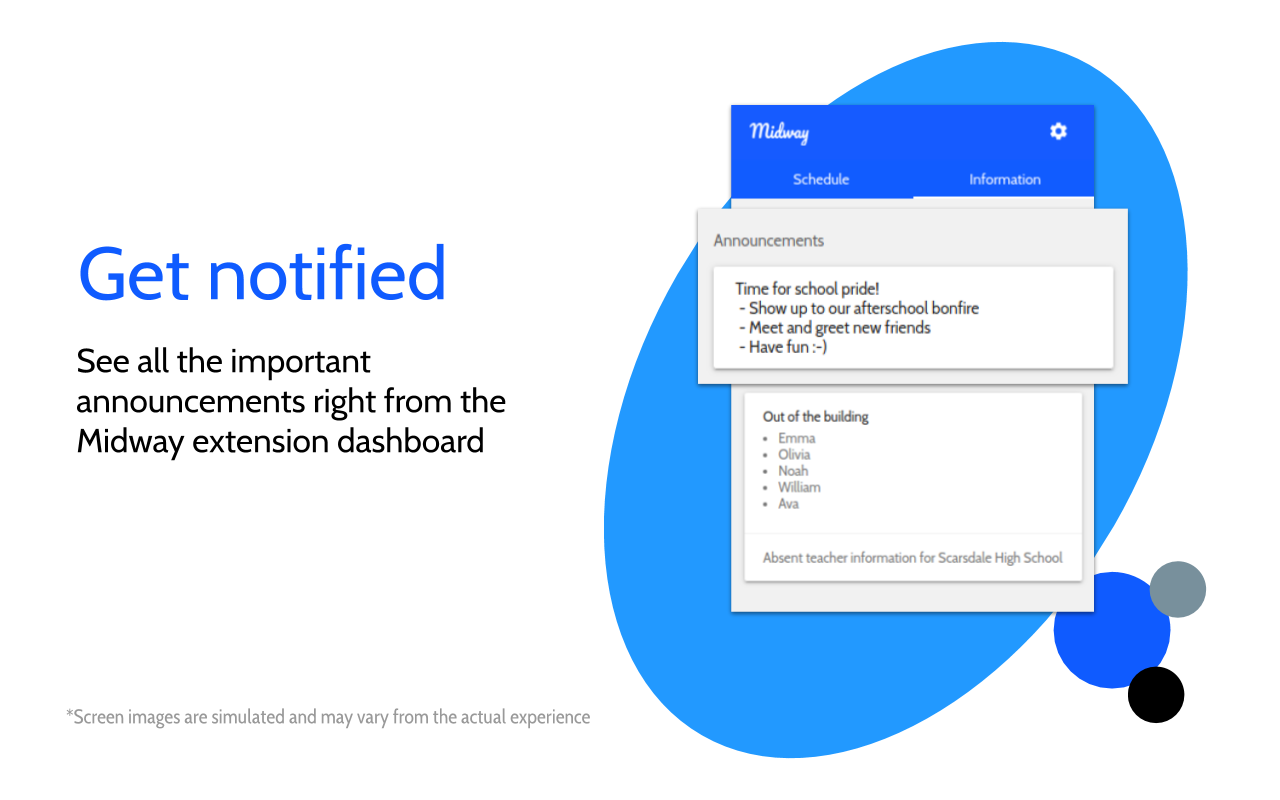
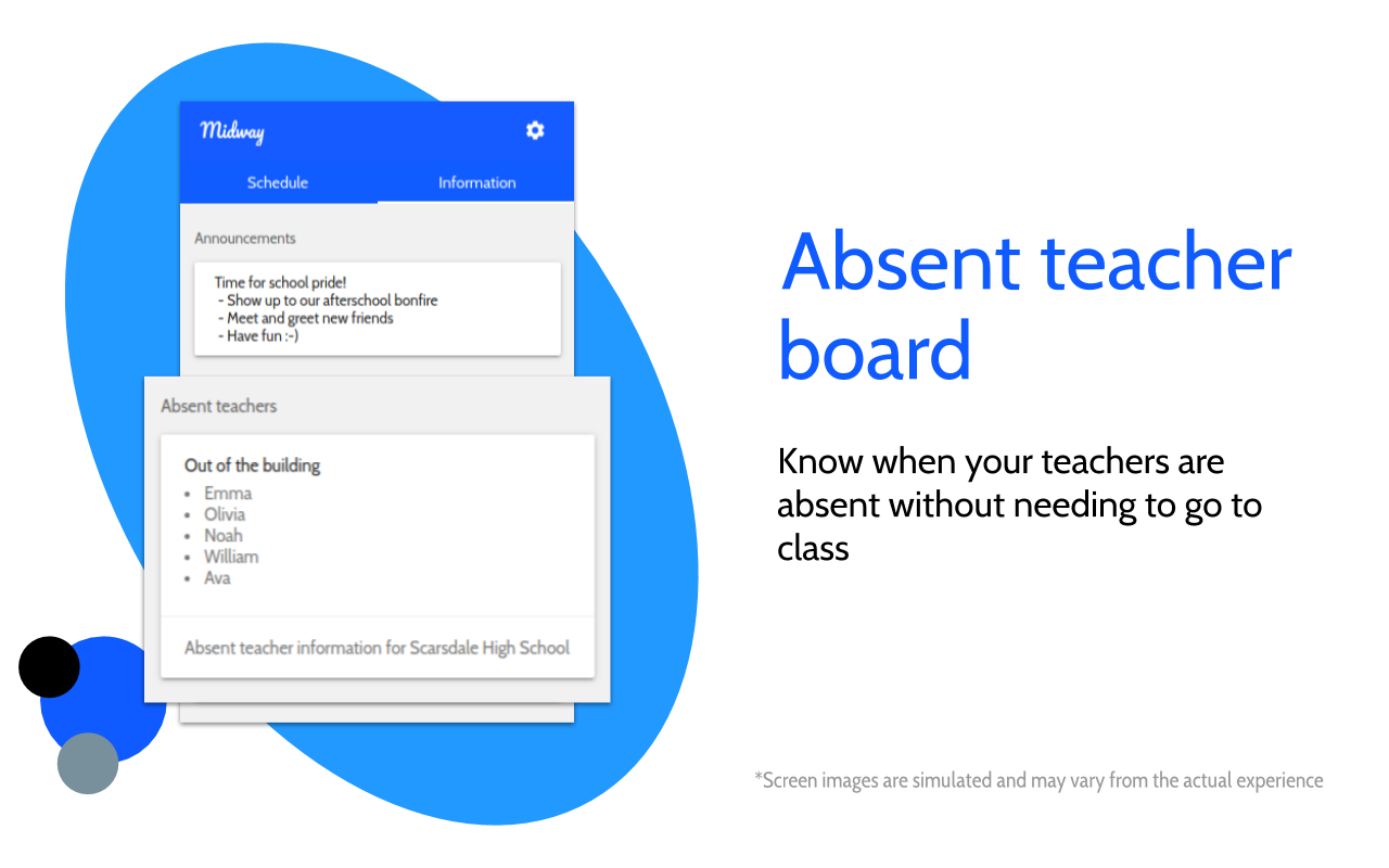
The dashboard now shows absent teachers and school announcements, helping students and faculty stay in the know.
Better support for complex schedules
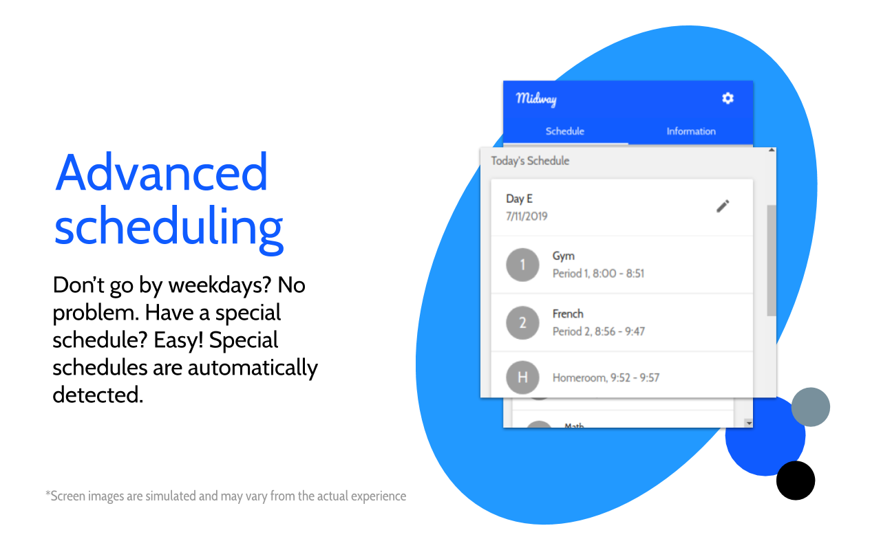
Midway’s schedules can now be updated remotely, allowing admins to add special schedules whenever it is necessary. The scheduling system was also re-worked to allow application of “patches” which can be applied to user schedules so that the Midway experience is customized for the user (this feature is disabled for all users except dev accounts).
Final Thoughts
Midway’s latest version is truly a departure from all previous versions. Though I may be biased, I think that Midway now looks much more professional than it did in years past. The User Experience (UX) is more refined; the graphic design is more refined; and the branding is more refined. In the coming years, I hope to develop Midway further, expanding it beyond its current userbase. If you are interested in trying out Midway, check it out on the Chrome Web Store.
Related posts
Must-reads

Midway Through the Years

A Javascript Developer's Guide to Contributing to Firefox

What I learned winning 3rd place at StuyHacks IX: Misconceptions about Hackathons and Tips for Success

How I Got Started With Contributing to Firefox
