Midway may seem like a simple application that displays the current period details, but there are surprising ways that can get in the way of a frictionless experience. As a Chrome extension developed by a student for teachers, Midway is committed to a great user experience.
Integration with SMART Technologies
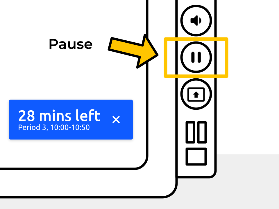
As a tool for facilitating efficient class time usage, one of the things I noticed was the widespread use of Midway alongside digital peripherals such as SMART boards. Especially among technologically-inclined teachers, much of the faculty make use of the pause feature on the SMART board, which freezes the display. One of the main issues of this feature is the fact that Midway’s timebox display will show an outdated time because the screen is frozen. When working on the Midway improvement, this was one of the key considerations.
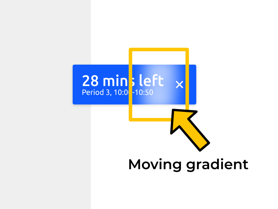
To address this problem, Midway now has an optional feature called timebox shimmer that displays a moving gradient on the timebox. This allows the end user to quickly determine whether or not the timebox is live. If teachers find this feature distracting, there is a toggle available in the settings to quickly enable or disable the feature.
Timebox Display Format
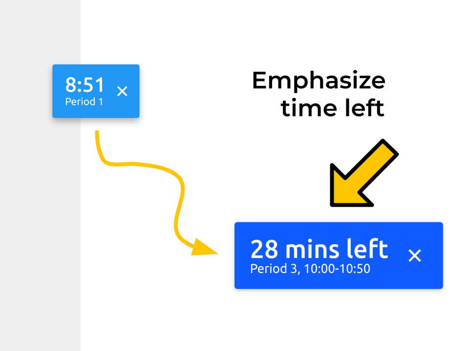
Speaking with numerous teachers, one of the most important pieces of information to know was actually not the period end time, but instead the number of minutes left in the period. As a result of this new information, Midway now emphasizes the number of minutes left in the period, allowing teachers to quickly determine what activities are appropriate for the given amount of class time remaining. Furthermore, there is now an additional option for a more compact version of the timebox for a more convenient experience.
Frictionless Sign-in
During the onboarding process, users must sign in with their Google account to complete the sign up process. However, all too often, users are unable to figure out how to sign in and don’t realize that they need to activate the browser action/popup. Consequently, they are unable to properly use Midway.
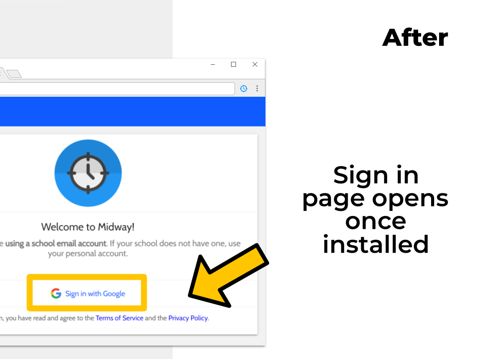
As an improvement over this situation, Midway now displays the sign in button directly on the onboarding screen, allowing them to sign in without having to find the browser popup. Right after signing in, Midway immediately redirects the user to the welcome screen and displays the timebox. In this way, they can have immediate confirmation of the successful installation of Midway and the timebox.
Related posts
Must-reads
Midway Through the Years

An Amazing Win at the NYC Student Disrupt Hackathon

A Javascript Developer's Guide to Contributing to Firefox

How I optimized my fractal viewer and the things I learned along the way
